# Draft to Document: Why I Made My Notes Look Like LaTeX Papers
*November 2026*
*On Reitz LaTeX, an Obsidian theme where you write like iA Writer and read like a LaTeX paper.*
Your notes are drafts while you write them. When you read them back, they should look like they matter.
That sentence is the whole reason I built [Reitz LaTeX](https://github.com/kennethreitz/obsidian-reitz-latex), a theme for Obsidian. It's small and opinionated. I want to explain the thinking behind it, because the thinking is really what it's about.
## The medium is the message
McLuhan was right. How a thing looks isn't decoration on top of the content. It changes what the content *is*.
The same paragraph reads as a scribble in one typeface and as an argument in another. Set your thinking like a scratchpad and you'll treat it like one. Set it like a paper and you'll start writing papers.This is the same bet as the rest of the work. The interface is not a costume you put on afterward. It is the room the thinking happens in.
So the theme takes a deliberate position: aesthetics come first. The look is the point, not a finish applied at the end. I know that's an unfashionable thing to say about a tool. But I've found that how my notes look changes how I think about them.
## Writing and reading are different acts
Most themes treat editing and reading as one surface. I don't think they are. Writing is a workshop. Reading is the finished thing. So Reitz LaTeX gives Obsidian two modes of mind.
### Write: the workshop
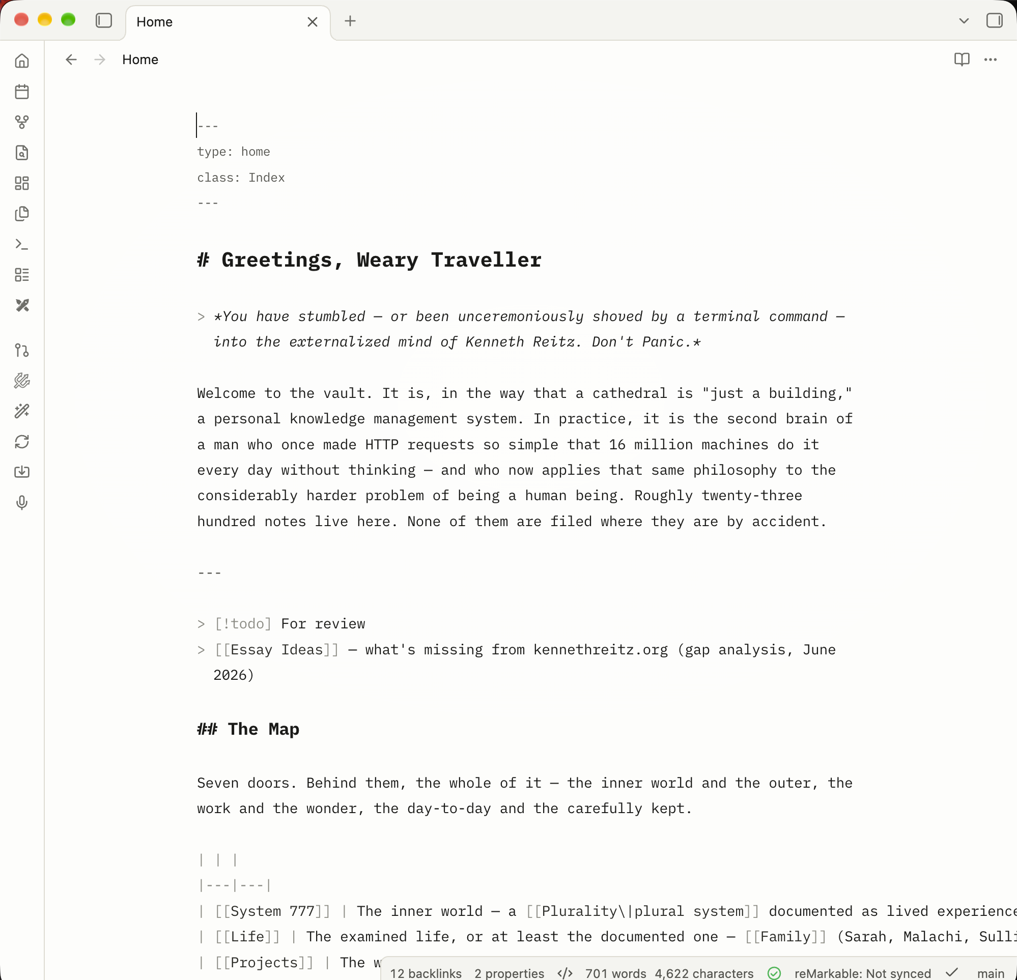
The editor takes its cue from iA Writer. Everything is set in IBM Plex Mono, with headings, bold, and italic all in one honest monospace. There's a centered 760px measure, a warm active-line glow, a breathing cursor, faint indent guides, and a soft spotlight vignette behind the text.
Markdown stays visible and plain. Nothing is justified or hyphenated, so the text never shifts under your cursor. It's a quiet room where you're alone with the words.
### Read: the paper
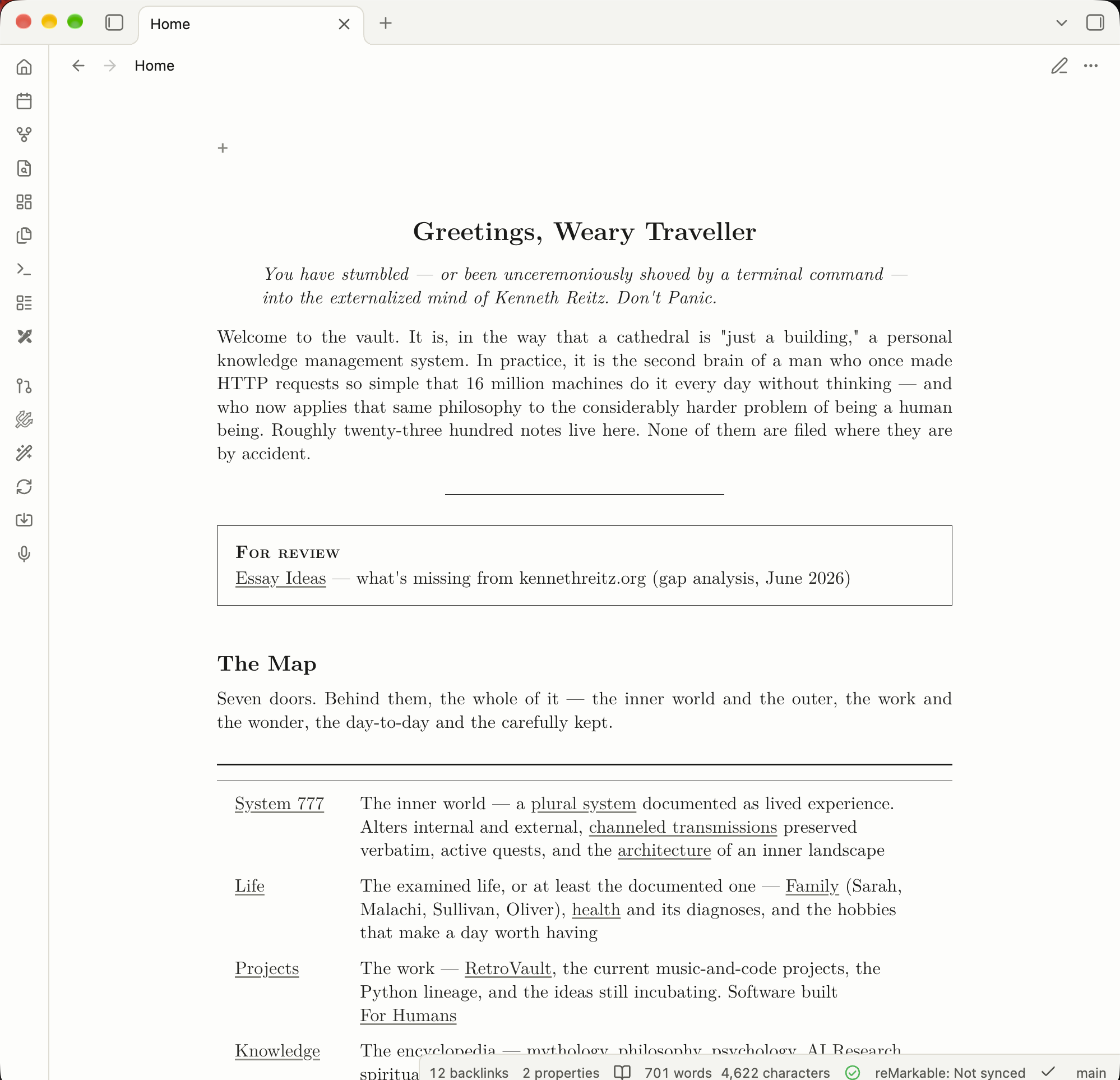
Then you switch to Reading view, and the same note becomes a document. The body is set in Latin Modern Roman at a LaTeX-faithful scale. The title is centered like `\maketitle` in its own optical face. Section headings follow LaTeX's measured size ratios. Paragraphs are justified and hyphenated. The measure, about 41rem, is tuned to the `\textwidth` of a LaTeX article on US Letter.
Going from one to the other should feel like a change of state: from draft to document. (Tip: write in **Source mode**, read in **Reading view**, and flip between them with `⌘E` / `Ctrl+E`.)
## Information architecture is the real feature
This is the part I care about most. Typography is how structure becomes visible, which is the same idea as [visual hierarchy](/essays/2025-09-19-visual-hierarchy-and-the-shape-of-attention). A good page tells you, before you read a word, what's a title, a section, an aside, a citation, or a figure.
So every Obsidian element gets one clear role in a document hierarchy, the way it would in a paper:
- **Callouts become theorem environments**, `amsthm`-style, with a hairline box and a small-caps run-in label.
- **Embeds and transclusions become quotations**, not boxed widgets.
- **Footnotes drop below a short rule**, like `\footnoterule`, set in the 7pt optical face.
- **Tables are `booktabs`**, centered at the measure. Wide ones scroll instead of clipping.
- **Images are figures**, centered like `\begin{figure}\centering`.
- **Dataview results become tables in the body**, matching the article.
- **Mermaid diagrams look like TikZ**: paper-filled nodes, ink hairlines, and serif labels.
When each thing has one job, the shape of your thinking is legible at a glance.
## The typefaces
All the fonts are embedded as WOFF2, so there are no network calls and nothing to install. It works offline.
| Role | Face | Why |
|---|---|---|
| Body (reading) | Latin Modern Roman | The modern descendant of Knuth's Computer Modern, the face of TeX itself |
| Title | Latin Modern Roman Caps / 12pt optical size | `\maketitle` uses the larger optical cut |
| Footnotes & superscripts | Latin Modern Roman 7 | LaTeX sets `\footnotesize` from cmr7 |
| Code (reading) | Latin Modern Mono | LaTeX's `\texttt`, ligatures off |
| Editor | IBM Plex Mono | A warm, precise monospace for the workshop |
| Interface | System UI font | LaTeX has no interface chrome, so the app stays native |
Math is already rendered by MathJax in Computer Modern, so it matches the body with no extra work. I love when things just fit together like that.
## The small things
A lot of the work is in details you'd only notice if they were wrong:
- LaTeX's 10pt/12pt leading ratio, adapted for screens, and microtypography that approximates the `microtype` package.
- `parskip`-style paragraphs: space between, no first-line indent.
- Lining tabular numerals in tables, so numeric columns line up.
- Monochrome, `listings`-style code highlighting, with ligatures off so `->` and `>=` never fuse.
- Tags render as typewriter text, not pills. Highlights and selection share one warm yellow wash.
- Hover previews look like a slip of paper.
- Print and PDF exports look like a real paper, with external URLs printed after their link text. That's the whole point of looking like LaTeX.
- Light mode is ink on paper. Dark mode is the same Latin Modern on dark paper.
## Installing it
**From Obsidian** (once it's listed in Community Themes): open **Settings → Appearance → Themes → Manage**, search for **Reitz LaTeX**, and click **Install and use**.
**Manually:** download `theme.css` and `manifest.json` from the [latest release](https://github.com/kennethreitz/obsidian-reitz-latex/releases/latest), put them in `/.obsidian/themes/Reitz LaTeX/`, then pick **Reitz LaTeX** under **Settings → Appearance → Themes**.
**From source:**
```bash
$ git clone https://github.com/kennethreitz/obsidian-reitz-latex.git \
"/.obsidian/themes/Reitz LaTeX"
```
Run `$ git pull` to update.
## Why bother
I could have kept using a default theme. Plenty of people do, and their notes are fine. But I keep coming back to that idea: set your thinking like a paper and you'll start writing papers. I wanted my [vault](/essays/2026-03-06-obsidian_vaults_and_claude_code) to treat my thoughts with a little dignity when I read them back.
If that resonates, give it a try. The theme is MIT-licensed. The fonts are Latin Modern (GUST Font License) and IBM Plex Mono (SIL OFL 1.1). It's [on GitHub](https://github.com/kennethreitz/obsidian-reitz-latex).
Made [for humans](/knowledge/philosophy/for-humans).