

On Reitz LaTeX, an Obsidian theme where you write like iA Writer and read like a LaTeX paper.
Your notes are drafts while you write them. When you read them back, they should look like they matter.
That sentence is the whole reason I built Reitz LaTeX, a theme for Obsidian. It's small and opinionated. I want to explain the thinking behind it, because the thinking is really what it's about.
The medium is the message
McLuhan was right. How a thing looks isn't decoration on top of the content. It changes what the content is.
The same paragraph reads as a scribble in one typeface and as an argument in another. Set your thinking like a scratchpad and you'll treat it like one. Set it like a paper and you'll start writing papers.This is the same bet as the rest of the work. The interface is not a costume you put on afterward. It is the room the thinking happens in.
So the theme takes a deliberate position: aesthetics come first. The look is the point, not a finish applied at the end. I know that's an unfashionable thing to say about a tool. But I've found that how my notes look changes how I think about them.
Writing and reading are different acts
Most themes treat editing and reading as one surface. I don't think they are. Writing is a workshop. Reading is the finished thing. So Reitz LaTeX gives Obsidian two modes of mind.
Write: the workshop
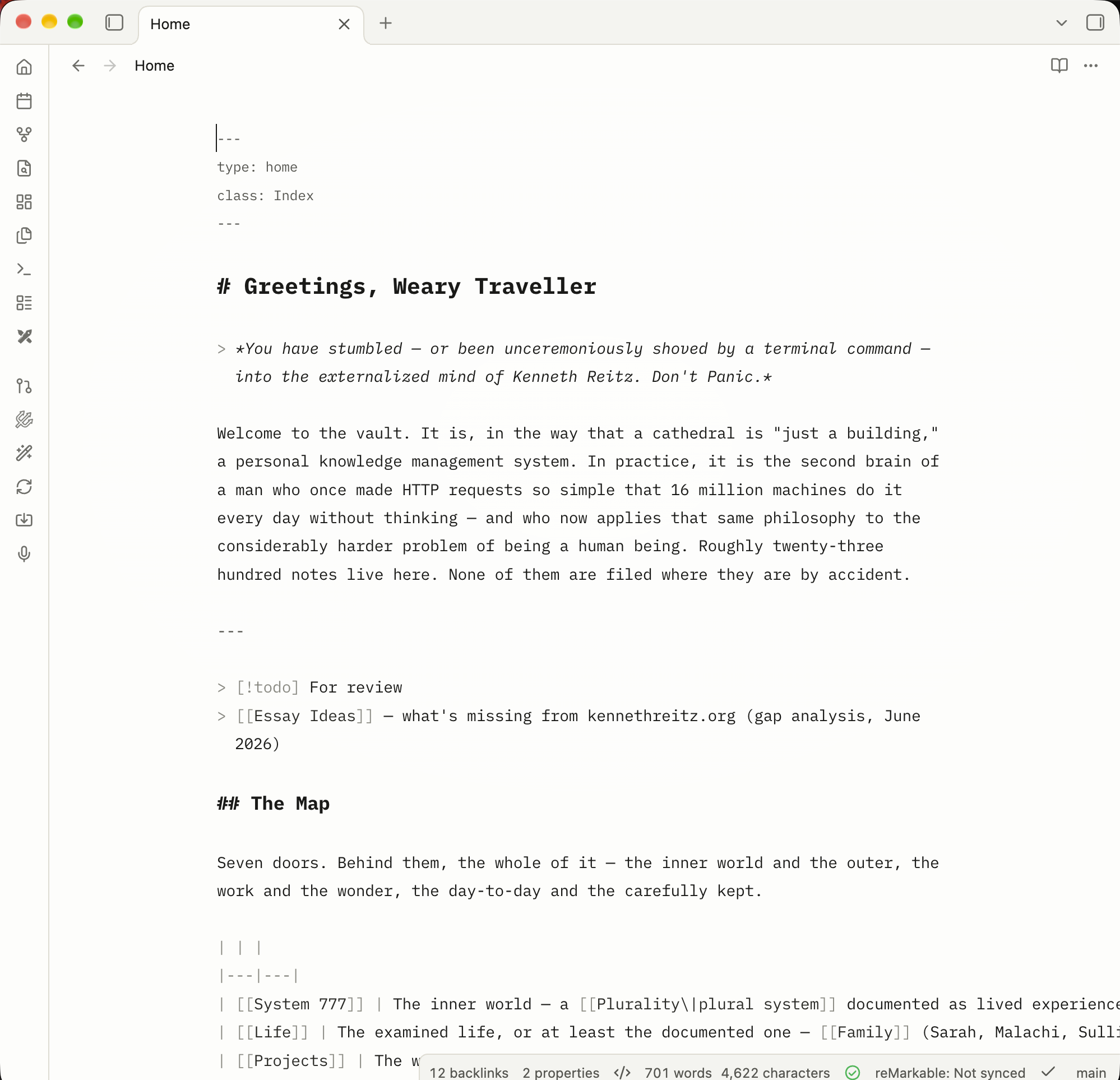
The editor takes its cue from iA Writer. Everything is set in IBM Plex Mono, with headings, bold, and italic all in one honest monospace. There's a centered 760px measure, a warm active-line glow, a breathing cursor, faint indent guides, and a soft spotlight vignette behind the text.
Markdown stays visible and plain. Nothing is justified or hyphenated, so the text never shifts under your cursor. It's a quiet room where you're alone with the words.
Read: the paper
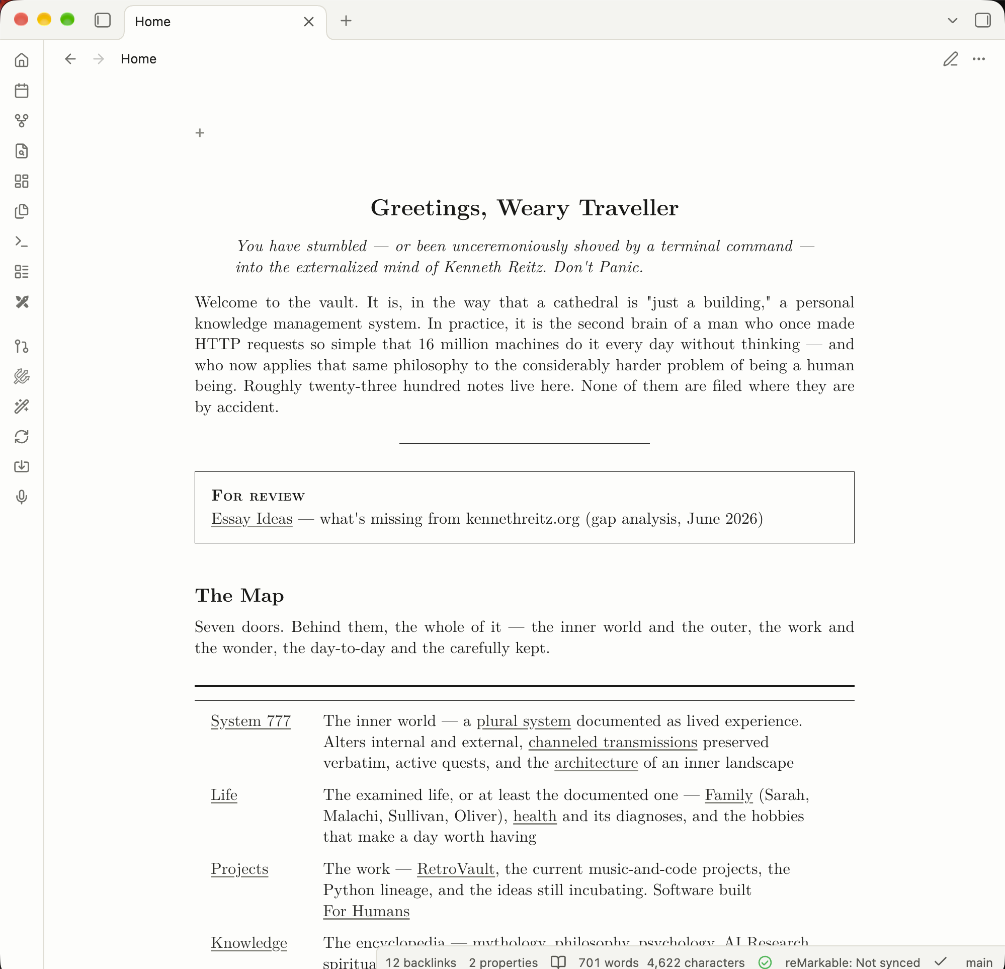
Then you switch to Reading view, and the same note becomes a document. The body is set in Latin Modern Roman at a LaTeX-faithful scale. The title is centered like \maketitle in its own optical face. Section headings follow LaTeX's measured size ratios. Paragraphs are justified and hyphenated. The measure, about 41rem, is tuned to the \textwidth of a LaTeX article on US Letter.
Going from one to the other should feel like a change of state: from draft to document. (Tip: write in Source mode, read in Reading view, and flip between them with ⌘E / Ctrl+E.)
Information architecture is the real feature
This is the part I care about most. Typography is how structure becomes visible, which is the same idea as visual hierarchy. A good page tells you, before you read a word, what's a title, a section, an aside, a citation, or a figure.
So every Obsidian element gets one clear role in a document hierarchy, the way it would in a paper:
- Callouts become theorem environments,
amsthm-style, with a hairline box and a small-caps run-in label. - Embeds and transclusions become quotations, not boxed widgets.
- Footnotes drop below a short rule, like
\footnoterule, set in the 7pt optical face. - Tables are
booktabs, centered at the measure. Wide ones scroll instead of clipping. - Images are figures, centered like
\begin{figure}\centering. - Dataview results become tables in the body, matching the article.
- Mermaid diagrams look like TikZ: paper-filled nodes, ink hairlines, and serif labels.
When each thing has one job, the shape of your thinking is legible at a glance.
The typefaces
All the fonts are embedded as WOFF2, so there are no network calls and nothing to install. It works offline.
| Role | Face | Why |
|---|---|---|
| Body (reading) | Latin Modern Roman | The modern descendant of Knuth's Computer Modern, the face of TeX itself |
| Title | Latin Modern Roman Caps / 12pt optical size | \maketitle uses the larger optical cut |
| Footnotes & superscripts | Latin Modern Roman 7 | LaTeX sets \footnotesize from cmr7 |
| Code (reading) | Latin Modern Mono | LaTeX's \texttt, ligatures off |
| Editor | IBM Plex Mono | A warm, precise monospace for the workshop |
| Interface | System UI font | LaTeX has no interface chrome, so the app stays native |
Math is already rendered by MathJax in Computer Modern, so it matches the body with no extra work. I love when things just fit together like that.
The small things
A lot of the work is in details you'd only notice if they were wrong:
- LaTeX's 10pt/12pt leading ratio, adapted for screens, and microtypography that approximates the
microtypepackage. parskip-style paragraphs: space between, no first-line indent.- Lining tabular numerals in tables, so numeric columns line up.
- Monochrome,
listings-style code highlighting, with ligatures off so->and>=never fuse. - Tags render as typewriter text, not pills. Highlights and selection share one warm yellow wash.
- Hover previews look like a slip of paper.
- Print and PDF exports look like a real paper, with external URLs printed after their link text. That's the whole point of looking like LaTeX.
- Light mode is ink on paper. Dark mode is the same Latin Modern on dark paper.
Installing it
From Obsidian (once it's listed in Community Themes): open Settings → Appearance → Themes → Manage, search for Reitz LaTeX, and click Install and use.
Manually: download theme.css and manifest.json from the latest release, put them in <your vault>/.obsidian/themes/Reitz LaTeX/, then pick Reitz LaTeX under Settings → Appearance → Themes.
From source:
$ git clone https://github.com/kennethreitz/obsidian-reitz-latex.git \
  "<your vault>/.obsidian/themes/Reitz LaTeX"
Run $ git pull to update.
Why bother
I could have kept using a default theme. Plenty of people do, and their notes are fine. But I keep coming back to that idea: set your thinking like a paper and you'll start writing papers. I wanted my vault to treat my thoughts with a little dignity when I read them back.
If that resonates, give it a try. The theme is MIT-licensed. The fonts are Latin Modern (GUST Font License) and IBM Plex Mono (SIL OFL 1.1). It's on GitHub.
Made for humans.


